Why Two Stripes Clash but Stripes and Florals Don't
Here's a style puzzle: wear a pinstripe shirt with pinstripe trousers and you'll look like you fell into a barbershop. Wear a pinstripe shirt with a floral skirt and it can look great. Same number of patterns. Totally different result.
The difference isn't about "more patterns = worse." It's about which patterns fight for attention and which ones work together.
The two laws of pattern mixing
Two principles do almost all the work. Everything else follows from these:
Law 1: Patterns within the same family compete. Two striped pieces fight each other. Two florals do the same. Your eye keeps trying to make them into one cohesive pattern. When it can't, the whole outfit gets loud.
Law 2: Patterns from different families at different scales can work together. A bold geometric and a fine pinstripe don't compete because they operate at different sizes. You process them separately, so they complement instead of clash.
That's really it. Everything else is just how you apply this.
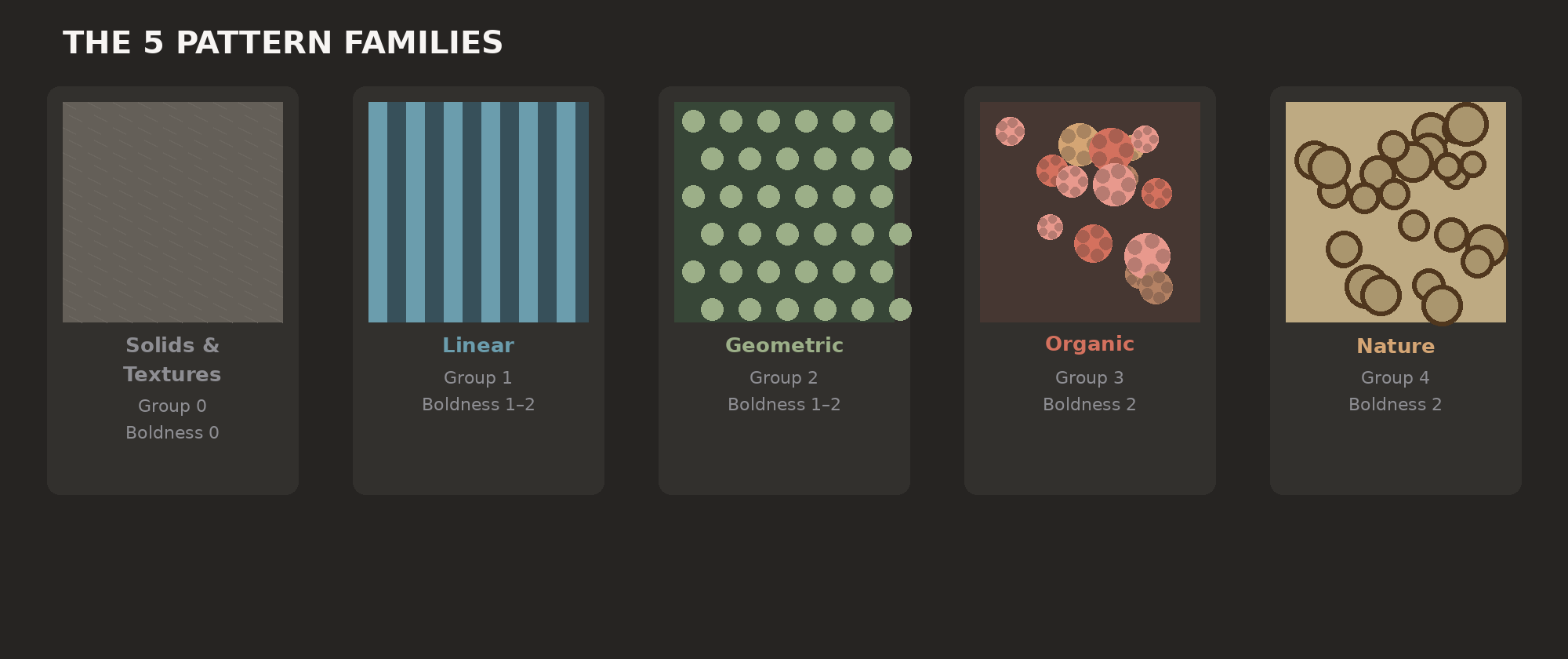
The pattern families
Patterns fall into natural groups based on how they're structured:
Solids and textures (Group 0) — No pattern. Just solid colors and woven textures (herringbone, tweed) and subtle tonal details. Neutral. Pair with anything without adding pattern noise.
Linear patterns (Group 1) — Stripes and plaids. They're organized, repetitive, geometric. They have a rhythm that's easy to read, but that same rhythm can clash hard when you put two together.
Geometric patterns (Group 2) — Polka dots and abstract geometric prints. Regular and repeating, but more visual complexity than stripes.
Organic patterns (Group 3) — Florals, paisley, and flowing abstract prints. The irregularity actually works in your favor. They conflict less with structured patterns because they don't have that locked-in visual rhythm.
Nature patterns (Group 4) — Camo and animal prints. These are bold and grab attention immediately. They carry so much visual weight they basically live in their own category.
Why mixing within a family fails
Two pieces from the same pattern family create visual interference. Like two radio stations bleeding into each other.
Two stripes at similar scales mess with your eyes. Your brain tries to make them align and fails. Two florals, unless you really plan it out, make both patterns disappear into visual noise. Two animal prints is just loud chaos.
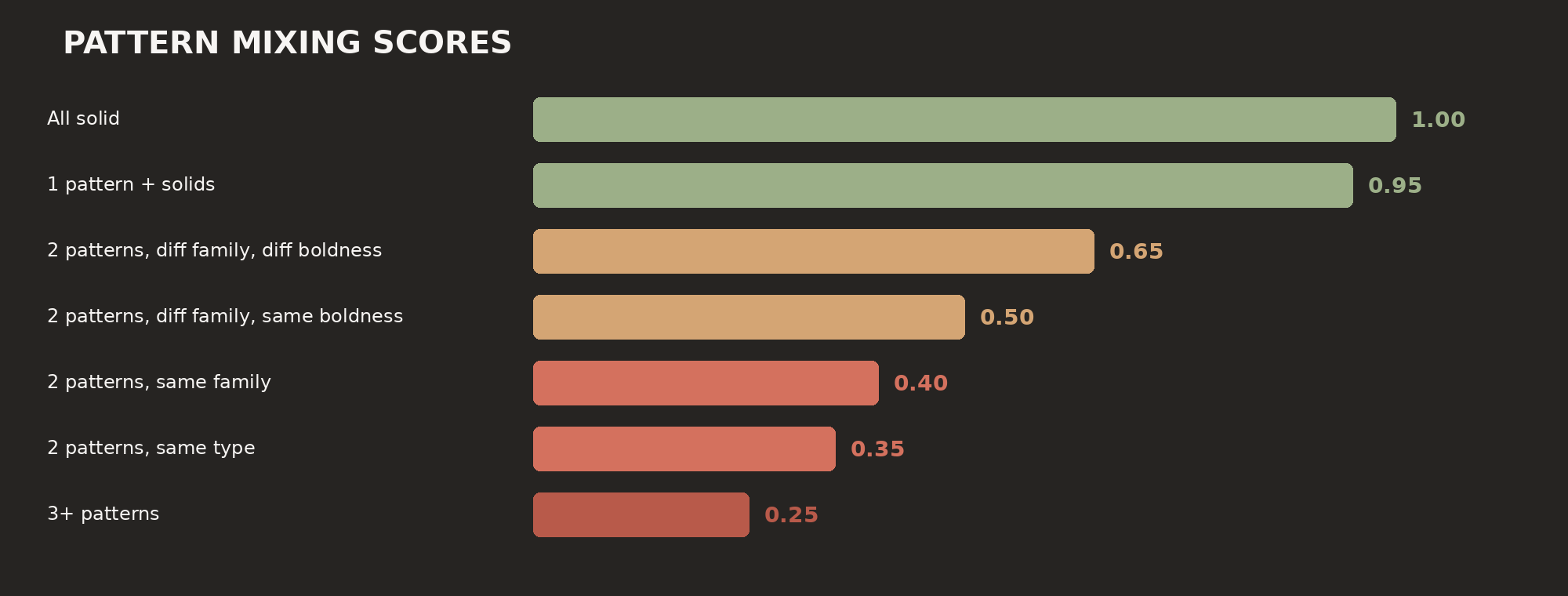
Outfii scores same-pattern at 0.35 and same-family at 0.4. Bottom of the scale for good reason.
Boldness levels: the scale factor
Even across different pattern families, scale matters. Patterns come in different boldness levels:
Boldness 0 — Solids and textures. Basically invisible as a pattern.
Boldness 1 — Stripes and polka dots. You see them, but they're restrained. They add texture without taking over the outfit.
Boldness 2 — Plaid, geometric prints, florals, paisley, camo, animal prints. These demand attention.
When you combine different families, this matters. A stripe (boldness 1) with a floral (boldness 2) creates clear hierarchy: floral leads, stripe supports. Balanced. You know where to look.
Two boldness-2 patterns from different families can work, but it's riskier. Now your eye has two equally loud things to process. Outfii scores different-family/different-boldness at 0.65. Same boldness? 0.5.
The numbers
Here's how Outfii scores pattern combinations:
0 patterned items (all solid) — 1.0. No patterns means no clashes.
1 patterned item — 0.95. One pattern with solids almost always works. The small deduction just means the pattern still needs to coordinate with your colors, but that's easy.
2 patterned items, same pattern type — 0.35. Two stripes. Hard to pull off.
2 patterned items, same family — 0.4. Stripes with plaid. Better than duplicating the exact pattern, but still tricky.
2 patterned items, different families, different boldness — 0.65. The actual sweet spot. A stripe with a floral. A polka dot with a geometric.
2 patterned items, different families, same boldness — 0.5. Can work, but neither pattern wins. Both want attention.
3+ patterned items — 0.2–0.3. Three patterns is for people who know what they're doing. Impressive when it lands. Messy when it doesn't.
The solid anchor rule
The safest approach: anchor with solids. One patterned piece? Everything else solid. Two patterns? Put a solid layer between them (a solid jacket over a patterned shirt and pants, for instance).
Solids are visual breathing room. They let your eye rest between patterns, which keeps an outfit from feeling overstuffed. In Outfii's system, boldness-0 pieces don't even count as patterned. So they can't clash.
When more patterns work
Three patterns can totally work. Menswear people do it all the time: striped shirt, patterned tie, pocket square. The trick is scale. Each pattern lives at a different size, so your eye can process them separately. They don't fight.
The other way to make multiple patterns work: shared color. A floral top and a geometric scarf in the same blues and greens feel planned, even if the patterns don't match. Shared color signals intention.
Outfii's pattern score is just one piece. An outfit might score 0.3 on pattern but 0.95 on color and 0.85 on formality. The whole thing balances.
How to actually do this
Start with one pattern. Most of us wear too few patterns, not too many. Get used to one pattern with all solids first.
Add a second from a different family and size. Thin stripes + large check. Polka dots + floral. Different visual structure.
Make one the lead. A quiet pinstripe under a bold floral beats two equally loud prints fighting each other.
Use shared color as a safety net. Both patterns have the same blue or tan? Suddenly it feels intentional.
Break the rules when it works. Pattern mixing is the hardest part of getting dressed. The scores are a guide, but genuinely stylish people break this stuff all the time.
Want to see how your outfit patterns score? Download Outfii and get scored in seconds.
© 2026 Outfii. All rights reserved. This article is original content by Outfii Team. Republishing or redistribution without written permission is prohibited. Excerpts and links may be used, provided full credit is given to Outfii with a link back to the original article.
Ready to transform your wardrobe?
Outfii uses AI to help you organize, style, and make the most of every piece you own.
Download the App