Why That Outfit Works: Color Harmony, Explained with Math
You know the feeling. You put on an outfit and something just clicks. The colors feel right. The whole thing looks pulled-together. Other days, you're wearing perfectly good clothes and it looks like you got dressed in the dark.
The difference is usually color harmony. It's not magic. It's geometry.
Harmony is about angles
Take a color wheel. Every color sits at an angle — red around 0°, yellow around 60°, green around 120°, blue around 240°. When the hues in your outfit land at certain angles relative to each other, they create recognizable patterns that the eye reads as intentional.
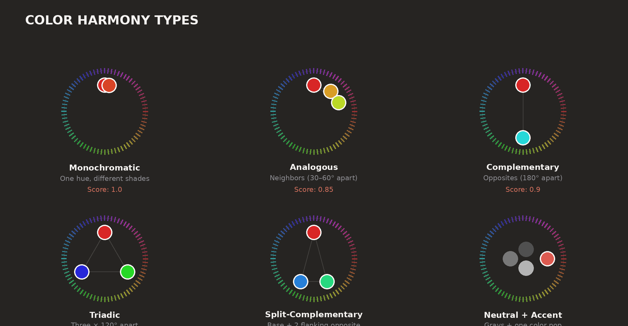
There are six main patterns worth knowing, plus two special cases for neutrals.
Monochromatic — one hue in different shades. Navy pants with a light blue shirt. A camel coat over cream. Hues sit within about 15° on the wheel. Easy to pull off, almost impossible to mess up.
Analogous — two or three neighboring hues, 30–60° apart. Olive green with mustard. Rust orange with burgundy. They feel calm because your eye can slide between them naturally.
Complementary — colors on opposite sides of the wheel, around 180° apart. Navy and burnt orange. Purple and yellow. They're high-contrast and energetic. Fashion photographers live for these.
Triadic — three hues evenly spaced at 120° apart. Red, yellow, blue. In real clothes, this usually feels too loud unless you mute it (brick red, olive, slate blue).
Split-complementary — a base hue plus the two colors flanking its opposite. Blue with red-orange and yellow-orange instead of straight orange. Contrast, but less punch.
Neutral — all achromatic colors. Black, white, gray. Scores 1.0 in Outfii's algorithm. No hue conflicts possible.
Neutral-accent — mostly black, white, or gray with one color hit. Black jeans, white tee, red sneakers. Hard to get wrong.
Clashing — colors that don't follow any pattern. Not bad for fashion. Just structurally messy.
How the algorithm actually works
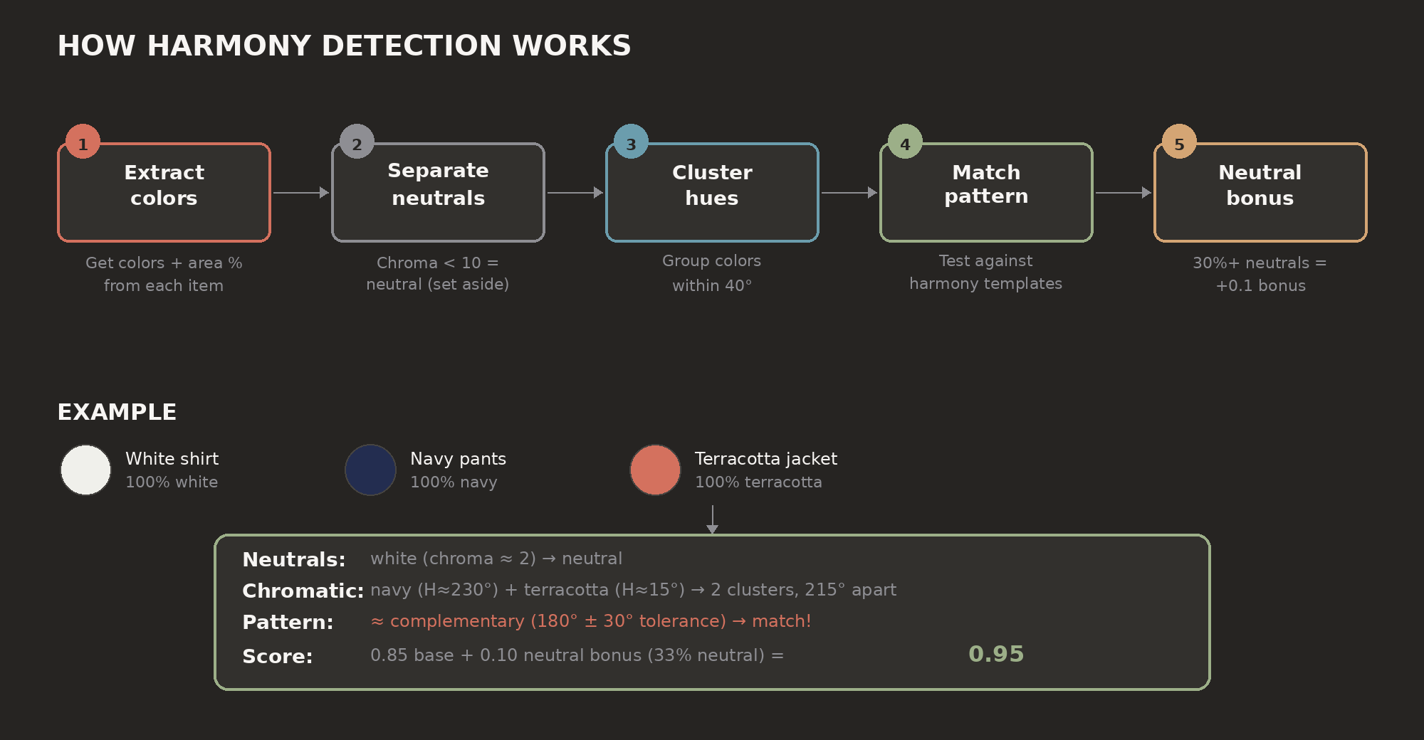
When Outfii scores the color harmony of an outfit, here's what happens under the hood:
Step 1: Extract colors. Each item has colors with area percentages. A striped shirt might be 60% white, 40% navy. Each item counts equally, with colors weighted by how much space they take up.
Step 2: Separate chromatic from neutral. Anything with low color saturation (below 10 in LCH space) is neutral. Black, white, gray. These get set aside for now.
Step 3: Cluster the hues. Colors within 40° of each other group together. The math uses a circular average (so 10° and 350° correctly average to 0°, not 180°).
Step 4: Match the pattern. The number of clusters tells us which patterns to test:
Zero clusters = all neutral = 1.0.
One cluster = monochromatic. Tight clusters (under 15° spread) score 1.0. Wider ones drop to 0.85 or 0.7.
Two clusters = check for analogous or complementary. Closer to the ideal angle = higher score.
Three clusters = check for triadic or split-complementary.
Step 5: Apply the neutral bonus. If neutrals cover 30% or more of the outfit, add 0.1 to the score (capped at 1.0). Neutrals stabilize everything.
The whole process takes about 2ms on a modern phone.
Tolerances matter more than you'd think
Real clothes don't hit exact angles. A complementary pair might sit at 165° instead of 180°. An analogous pair at 55° instead of 30°.
Outfii's tolerances came from testing real wardrobes. Too tight and everything clashes. Too loose and genuinely bad outfits squeak through. The sweet spot: ±30° for complementary, ±40° for analogous, ±30° for triadic.
Within each pattern, scores graduate smoothly. A true 180° pair scores better than 160°. A monochromatic outfit with 10° of hue variation scores better than one with 45°. No binary wins or losses.
Why all-black outfits score 1.0
Black jeans, charcoal tee, gray jacket = 1.0 harmony. No hue conflicts possible. It's not cheating. It's correct.
But color harmony is just one dimension. Outfii also scores formality, patterns, occasion, wear history. An all-black outfit nails harmony but might stumble on variety or context-fit.
When clashing is deliberate
Outfii scores clashing at 0.3. But fashion isn't always about harmony. Bright pink with red. Cobalt with emerald. Sometimes the clash is the point.
The score just describes what it sees. It doesn't judge. Whether you care is up to you.
What this means in practice
Want high harmony on autopilot? Neutrals plus one accent color (0.95), or one color family across different shades (1.0).
Want visual interest without risk? Analogous works. Earth tones. Blues and greens. Warm pinks and oranges. Hard to get wrong.
Complementary gives the most drama. But balance matters. Navy outfit with orange bag works. Navy and orange 50/50 usually doesn't.
And honestly: if your outfit clashes but you love it, wear it. Color theory is descriptive, not prescriptive.
Want to see how your outfits score on color harmony? Download Outfii — it runs the math so you don't have to.
© 2026 Outfii. All rights reserved. This article is original content by Outfii Team. Republishing or redistribution without written permission is prohibited. Excerpts and links may be used, provided full credit is given to Outfii with a link back to the original article.
Ready to transform your wardrobe?
Outfii uses AI to help you organize, style, and make the most of every piece you own.
Download the App